7 Team Member UI Elements for Modern Web Design
In the fast-paced world of digital product development, consistency is not just a nice-to-have; it is the backbone of user trust. When you are building a website for a startup, an agency, or a personal portfolio, the "About Us" or "Team" section often becomes an afterthought. Yet, this is where human connection happens. This is why having a reliable set of 7 Team Member UI Elements can transform a tedious design task into a streamlined workflow. These elements are not just placeholders; they are carefully crafted components designed to showcase your people with clarity and style.
The appeal of this specific UI kit lies in its balance between structure and flexibility. It avoids the rigid, cookie-cutter look that plagues many template libraries. Instead, it offers a clean, modern aesthetic that feels bespoke. Whether you are a seasoned designer looking to speed up your workflow or an entrepreneur managing your own brand identity, these widgets provide a solid foundation. They are built with the understanding that every brand has a unique voice, and the visual presentation of your team should reflect that.
Visual Characteristics and Design Personality
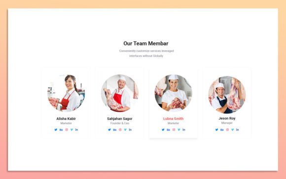
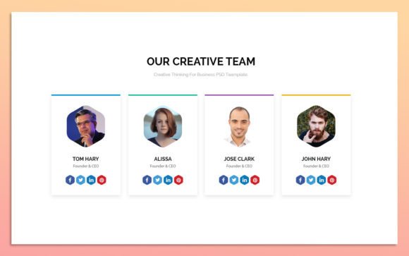
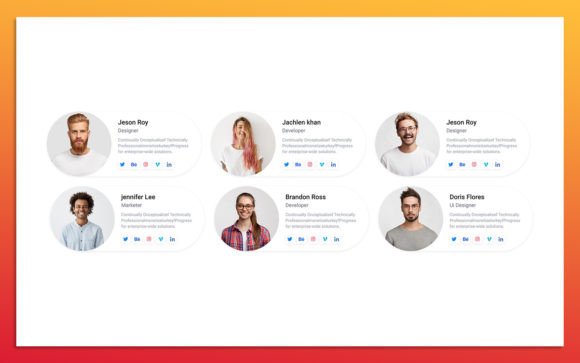
The visual language of these team member widgets is rooted in minimalism, but it is far from sterile. The design prioritizes whitespace, allowing each profile to breathe. This approach ensures that the focus remains on the individuals—their photos, their names, and their roles—rather than getting lost in decorative clutter. The lines are crisp, the corners are subtly rounded to soften the overall feel, and the typography hierarchy is pre-established to guide the viewer’s eye naturally.
One of the standout features is the scalability. Because the elements are 100% scalable and fully editable in Figma, you are not locked into a specific size or layout. You can stretch a card to fit a wide hero section or stack them vertically for a mobile-first approach without losing quality. The layers are fully organized, meaning you won’t spend hours hunting for the right group or layer name. This level of organization speaks to a professional standard that respects your time.
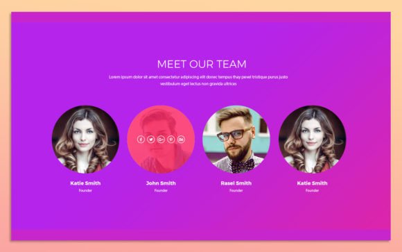
The personality of these elements is adaptable. With simple color style changes, you can shift the mood from corporate and trustworthy to playful and creative. If your brand uses bold, vibrant colors, the widgets accommodate this easily. If you prefer a monochrome, sophisticated look, the default settings support that too. This versatility makes them suitable for a wide range of industries, from tech startups to creative studios.
Enhancing Brand Identity and User Engagement
How you present your team directly influences brand perception. A sloppy or inconsistent team page can signal a lack of attention to detail, while a polished, cohesive design signals professionalism and reliability. Using a standardized set of UI elements ensures that every team member is presented with equal weight and dignity. This consistency reinforces your brand identity, making your site feel more established and credible.
Readability and visual hierarchy play crucial roles here. The pre-defined text styles in these widgets use Google Fonts, which are widely recognized for their screen readability. By leveraging familiar typefaces, you reduce cognitive load for your visitors. They don’t have to struggle to read names or job titles; the information is presented clearly. This ease of consumption keeps users engaged longer, increasing the likelihood that they will explore further or reach out for contact.
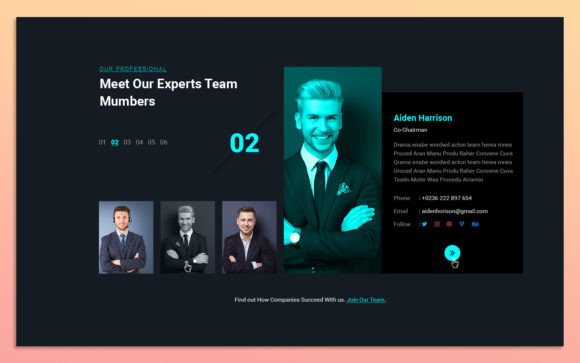
Moreover, these elements help in creating a narrative. When the design is uniform, the differences in the photos and bios stand out more. This allows the personalities of your team members to shine through. In marketing and publishing, this human element is vital. People buy from people. By using high-quality, customizable design assets, you are investing in the human side of your business, which is often the key differentiator in crowded markets.
Practical Applications Across Industries
The utility of these team member widgets extends far beyond standard corporate websites. For web design agencies, they offer a quick way to prototype client sites with realistic content. For bloggers and content creators, they can be adapted to showcase guest authors or contributors, adding a layer of authority to the publication. In the realm of social media graphics, the individual cards can be exported and used as templates for "Employee Spotlight" posts, ensuring your social presence aligns with your web presence.
Entrepreneurs and small business owners will find particular value in the ease of customization. You do not need advanced design skills to swap out images or change hex codes. The Figma source file is intuitive. You can duplicate a card, drop in a new headshot, update the text, and you are done. This efficiency is invaluable when you are wearing multiple hats and need to launch or update your site quickly.
Even in editorial design or digital magazines, these layouts can inspire how contributor bios are structured. The clean separation of image and text is a timeless principle that works well in both digital and print contexts. While primarily designed for web UI, the principles of spacing and alignment used here are universal. If you are working on a packaging design project that includes a "Meet the Makers" section, the visual logic from these widgets can be translated effectively.
Getting the Most Out of Your UI Kit
To truly leverage these 7 Team Member UI Elements, start by auditing your current brand guidelines. What are your primary and secondary colors? Which fonts define your voice? Before you begin dragging and dropping, set up your Figma file with your brand’s color styles and text styles. This ensures that when you apply changes, they are global and consistent. It saves time in the long run and prevents the "frankenstein" look of mismatched hues.
When selecting images, aim for consistency in lighting and style. Even the best UI widget cannot fix a set of photos that clash wildly in tone. If possible, conduct a photoshoot with a unified background or editing preset. If you are using stock photos or existing headshots, try to apply a uniform filter or crop ratio to maintain visual harmony. The widgets are designed to handle various aspect ratios, but consistency enhances the professional feel.
Consider the context of where these elements will live. If they are part of a dense footer, you might want to use a more compact version with less padding. If they are the focal point of a landing page, you can afford more whitespace and larger typography. Test different configurations. Figma’s component properties make it easy to toggle visibility of certain elements, such as social media icons or short bios, allowing you to see what works best for your specific layout.
Finally, remember that these are starting points, not end goals. Feel free to break the rules. Add a subtle hover effect, change the border radius, or overlay a gradient. The fact that the file is fully editable means you have the freedom to iterate. Use the modern typography standards provided as a baseline, but tweak them to suit your unique audience. The goal is to create a team section that feels authentic to your organization, not just another template implementation.
In conclusion, integrating well-designed UI components like these team member widgets is a smart move for any digital project. They bridge the gap between aesthetic appeal and functional efficiency. By providing a structured yet flexible framework, they allow you to focus on what matters most: telling your team’s story. Whether you are refining a logo design system or overhauling your entire website, paying attention to these details elevates your overall creative font and design strategy, leaving a lasting impression on your visitors.